
The store layout is an important aspect while designing a store. Just because, we have built the store, got all the supplies, the work doesn’t end there. Now comes the tricky part- arranging and layout of the whole store. Sometimes, just because the store layout is weak, you may end up losing sales even though your store might be in the perfect location and contains a countless number of items.
Nowadays, structural design companies in Chennai recommend that after you get all the required permits for your construction, it is better to decide a suitable store layout too. The web page fitsmallbusiness.com too shares the same opinion on the importance of store layout for business.
Floor Plan Options
Grid/Straight Floor Plan
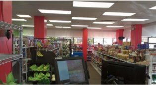
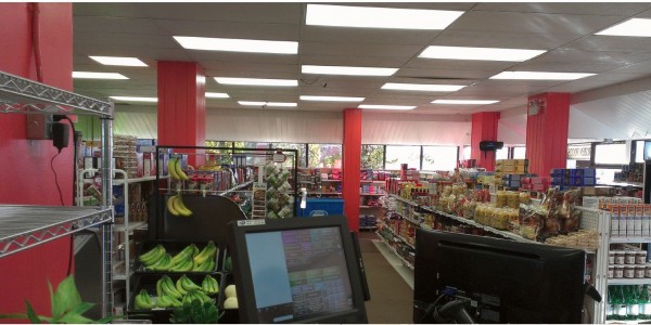
This floor plan efficiently uses both floor and wall space. The fixtures and displays always run parallel to the wall. The grid plan is pretty easy for customers to move around and store owners to categorize. This type of layout goes well for grocery, convenience, books, kitchen ware and home goods. But it is not suitable for upscale branded items.
Loop Floor Plan
This is also called racetrack layout. A loop store layout creates a guided shopping experience with a well-defined pathway. Here the customer is exposed to all the items on display. This is the technique by which client is surrounded by products all around with displays mainly on the walls or near walls. This layout goes well for apparel, accessories, toys, personal care, and other specialty products.
Free-Flow Floor Plan
This is the most creative one among all the floor plans and always has scope for innovations and changes. Here browsing is the king. Fixtures and displays are placed in no particular pattern but in angles and highlighted groups. This type of floor plan is best suited for boutiques and upscale products.
Transferring the decided floor plan to paper
After the decision of which floor plan to adopt, the next step is to transform it to paper. Even when the floor plan decision is not yet decided fully, it is advisable to start planning on paper. In some cases sticking to one type of floor plan may not work. It is always fun to let some creativity in, mix up 2 or maybe 3 of the floor plans and adopt it to your store space. The first step for this would be to collect the blueprint of the store and start off with it. In case the blueprint is missing, then simply draw up a basic plan of the store on paper, or better, a grid paper would be best and start planning the layout.
Exploring the customer behaviour
Whatever layout we choose, the products and fixtures have to be placed considering the customer traffic flow pattern. Let us take a quick look at the various customer behaviors.
Decompress Upon Entry
The general tendency of storekeepers would be to place new products, hot selling items, etc. near the door so that customers would first see that. But never do that. Experts recommend that the first few feet upon entering the store, 5 feet for small stores and 15 feet for a larger store, should not be cluttered. This zone is called decompression zone. Customers should not feel congested. Instead, they should be able to walk in free, feeling a sense of clutter free, welcome entry.
Right turn, Up Ahead
This is yet another interesting theory. Studies prove that people have an inclination to the side to which they are driving. For instance, in America people drive through the right side of the road and yes, when they enter a store, they would naturally first turn and walk through the right side. Similarly, in countries where people drive through left, those people will move on to the left side of the store first. Keeping this in mind, the store should be designed. For the right side traffic countries, main products should be placed to the right side of the store and the exit should be positioned towards the left side.
Personal Space
The customers would need space to walk through, browse through the products and not keep bumping on other clients. There should be space for people using strollers or wheelchairs too. Hence spacious pathways are a necessary factor to be considered while designing the layout.
Ensuring Maximum Product Exposure
Even after deciding on the layout and details, the products and fixtures should be placed in such a way that they get maximum exposure. Here are the methods to achieve that.
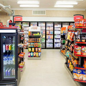
Zone design- placing best sellers at back of store
Zone design helps customers locate what they need, without much searching all around the area. For example, products can be divided into categories like kitchen/cooking, dining, home decor, etc. Also, best selling products should be placed to the rear of the store. This ensures that the shoppers would pass by the backside and take notice of the secondary products placed near it.
Zone merchandising- Low-cost impulse buying
Low-cost impulse products like small toys, chocolates, magazines, etc. are placed near the billing area. So, when the customer comes near billing area to pay the bill and leave, they would notice it and buy it.
Highlight power walls
Power walls are the areas on wall customer first notices upon entering. If the client flow pattern is towards the right side, then the right side wall near to entrance would be the power wall. Here new items, best sellers, etc. can be displayed. It should frequently be changed with the change in trends, and hence the wall should be planned keeping that in mind.
Use Speed bumps
The movement of customers through the store can be slowed down by using speed bumps like great merchandise or stands in the middle of the stores, thus making the client slow down and take a look at the items placed there.
Leave a Reply